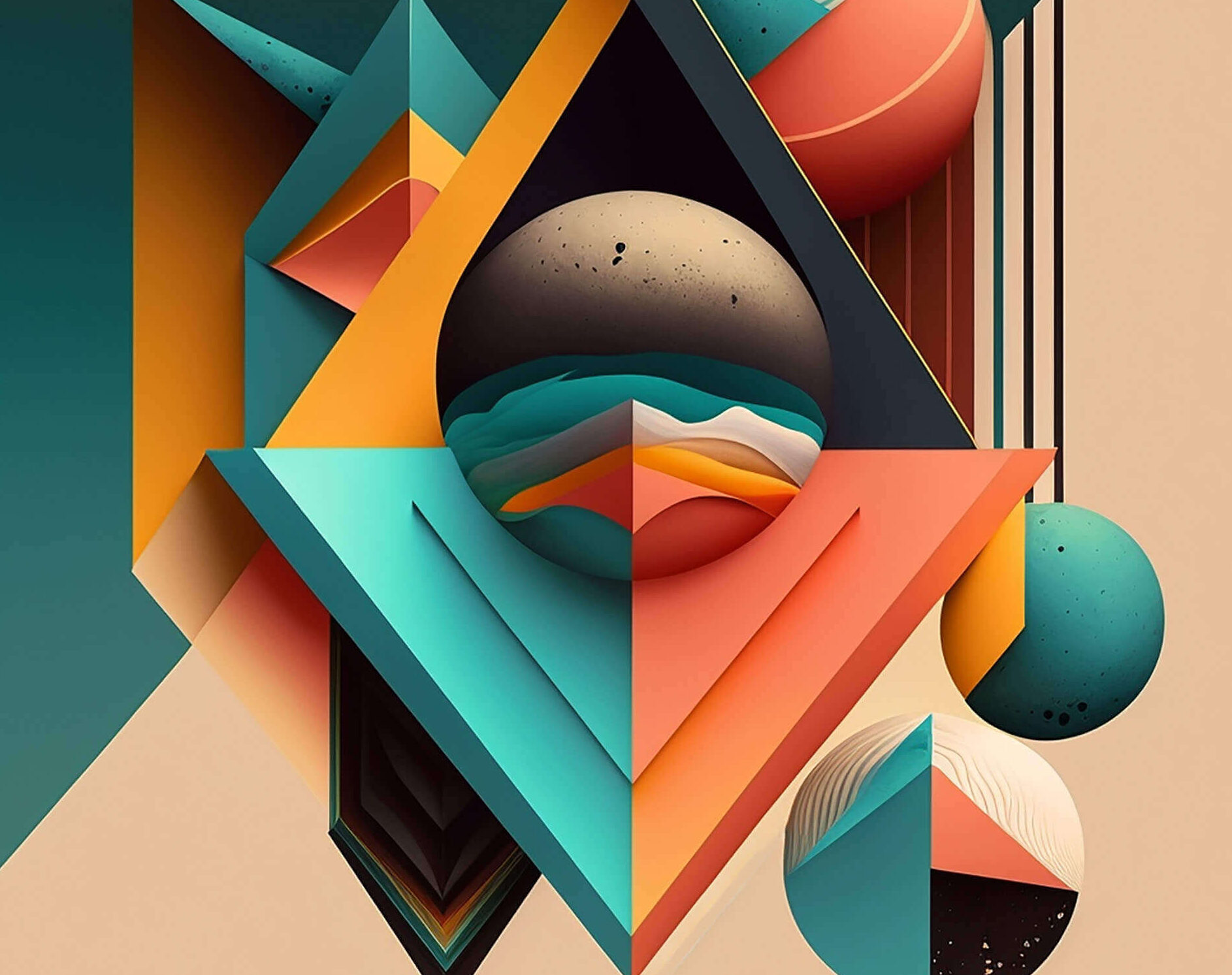
Color theory is a fundamental aspect of graphic design that involves understanding how colors interact with each other and how they can be used to create visually appealing designs. This guide will take you through the basics of color theory and how to apply it effectively in your graphic design projects.
1. The Color Wheel
The color wheel is a circular diagram of colors arranged by their chromatic relationship. It is a tool used to understand how colors relate to one another. The color wheel consists of:
- Primary Colors: Red, blue, and yellow. These colors cannot be created by mixing other colors.
- Secondary Colors: Green, orange, and purple. These are created by mixing primary colors.
- Tertiary Colors: These are created by mixing a primary color with a secondary color, resulting in colors like red-orange or blue-green.
2. Color Harmony
Color harmony refers to the aesthetically pleasing arrangement of colors. It involves using colors that create a sense of balance and order. Common color harmonies include:
- Complementary Colors: Colors opposite each other on the color wheel, such as blue and orange. These colors create a high contrast and vibrant look.
- Analogous Colors: Colors next to each other on the color wheel, such as blue, blue-green, and green. These create a harmonious and serene design.
- Triadic Colors: Three colors evenly spaced around the color wheel, such as red, yellow, and blue. This scheme is vibrant and balanced.
- Split-Complementary Colors: A variation of the complementary color scheme. It uses one base color and the two colors adjacent to its complementary color. This provides high contrast without the tension of complementary colors.
3. Color Temperature
Colors are often described as warm or cool:
- Warm Colors: Red, orange, and yellow. These colors evoke warmth, energy, and excitement.
- Cool Colors: Blue, green, and purple. These colors convey calmness, relaxation, and professionalism.
4. The Psychology of Color
Different colors can evoke different emotions and meanings. Understanding the psychology of color can help you choose the right colors for your design:
- Red: Energy, passion, danger.
- Blue: Trust, calm, sadness.
- Green: Growth, nature, health.
- Yellow: Happiness, caution, optimism.
- Purple: Luxury, creativity, mystery.
- Black: Power, elegance, mourning.
- White: Purity, simplicity, emptiness.
5. Practical Tips for Using Color in Graphic Design
- Use a Limited Color Palette: Too many colors can make a design look chaotic. Stick to a few key colors to create a cohesive look.
- Consider Contrast and Legibility: Ensure there is enough contrast between text and background colors for readability.
- Test Your Colors: Colors can look different on various screens and printed materials. Always test your colors in different formats.
- Use Color to Create Hierarchy: Highlight important elements in your design by using color strategically. For example, use a bold color for call-to-action buttons.
6. Tools for Working with Color
Several tools can help you choose and work with colors effectively:
- Adobe Color Wheel: An online tool to create color schemes.
- Coolors: A color scheme generator.
- ColorZilla: A browser extension for color picking.
- Paletton: A tool for generating color palettes based on the color wheel.
Understanding color theory is crucial for creating visually appealing and effective graphic designs. By mastering the color wheel, color harmony, color temperature, and the psychology of color, you can make informed decisions that enhance your designs. Use practical tips and tools to implement these concepts and create stunning graphic design projects.
